You People Wouldn’t Believe the Type Design in Blade Runner | WIRED #typefaces #fonts #typedesign #typography #film #OCD #subjectmatterexpert


DAVE ADDEY DOESN’T just watch movies. He dissects them.

Addey is the creator of Typeset In The Future, a website devoted entirely to fonts in science fiction. Why yes, it is a bastion of gloriously esoteric nerdery. It all began when Addey, a lifelong science fiction fan, started noticing the same font in every movie he watched: Eurostile Bold Extended… READ MORE: You People Wouldn’t Believe the Type Design in Blade Runner | WIRED

Inside the Hamilton Type Museum, Where You’re the Printer | WIRED #typefaces #typography


THE HAMILTON WOOD Type & Printing Museum is not of our time. But it’s what’s inside the museum that transports you to a time of pounding machines, toxic inks and shellac, sawdust and wood chips, with workers bent over cases of typefaces. The museum covers 80,000 square feet and houses 1.5 million pieces of type, 6,000 wooden printing plates, and 300 vintage wood type fonts, but it is as much about today as yesterday. The Hamilton is a working museum, where first-time visitors and longtime patrons alike can get their hands dirty. READ MORE: Inside the Hamilton Type Museum, Where You’re the Printer | WIRED

Related: Typography and Type Design | infophile

Handy Chart Helps You Understand the Elements of Typography | WIRED #typography #typefaces #fonts 


HANDY CHART HELPS YOU UNDERSTAND THE ELEMENTS OF TYPOGRAPHY

Source: Handy Chart Helps You Understand the Elements of Typography | WIRED

Related: Typography and Type Design | infophile

#Infographic: Everything You Ever Wanted to Know About #Fonts | The Digital Reader #typefaces #typography


As you can see in the following infographic from Cartridge Discount, fonts used for the web differ from ones designed for print. This graphic also explains the difference between serif and sans serif, and how most people have been mistakenly using the word “font” when writing online about “typefaces”. via Infographic: Everything You Ever Wanted to Know About Fonts | The Digital Reader.

For more information about fonts also see the infophile.ca resource Typography and Type Design.

The 5 Best #Fonts To Use On Your Resume | HuffPost #resumes


While resume font choice may seem trivial, experts say it’s actually pretty important. A bad font can take the focus off the accomplishments you’ve listed. READ MORE: The 5 Best Fonts To Use On Your Resume | HuffPost

How Google Designed An E-Book Font For Any Screen | Co.Design #fonts #typography


In January of 2014, a Pew study showed that nearly a third of American adults had read an e-book in the last year, and 50% of adults owned some kind of tablet or e-reading device. Many of these readers are using the wide variety of Android devices on the market, which can present a problem for those trying to create a standardized experience for e-book readers. Google faced this challenge while designing their new font, Literata, which will replace Droid Serif on Google Play Books. READ MORE: How Google Designed An E-Book Font For Any Screen | Co.Design | business + design.

The Story of Lorem Ipsum: How Scrambled Text by Cicero Became the Standard For Typesetters Everywhere | Open Culture


READ: The Story of Lorem Ipsum: How Scrambled Text by Cicero Became the Standard For Typesetters Everywhere | Open Culture

You may also like:

The Gorgeous Typeface That Drove Men Mad and Sparked a 100-Year Mystery | Gizmodo


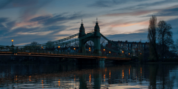
No one seemed to notice him: A dark figure who often came to stand at the edge of London’s Hammersmith Bridge on nights in 1916. No one seemed to notice, either, that during his visits he was dropping something into the River Thames. Something heavy.

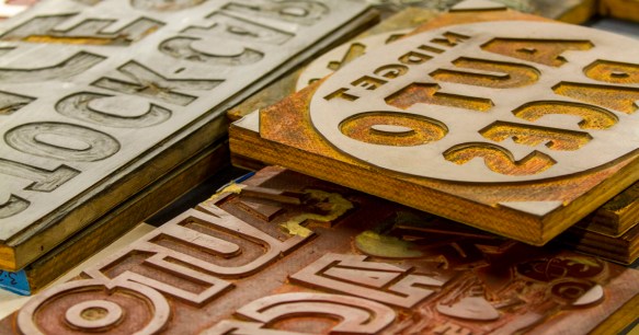
Over the course of more than a hundred illicit nightly trips, this man was committing a crime—against his partner, a man who owned half of what was being heaved into the Thames, and against himself, the force that had spurred its creation. This venerable figure, founder of the legendary Doves Press and the mastermind of its typeface, was a man named T.J. Cobden Sanderson. And he was taking the metal type that he had painstakingly overseen and dumping thousands of pounds of it into the river.

As a driving force in the Arts & Crafts movement in England, Cobden Sanderson championed traditional craftsmanship against the rising tides of industrialization. He was brilliant and creative, and in some ways, a luddite—because he was concerned that the typeface he had designed would be sold to a mechanized printing press after his death by his business partner, with whom he was feuding.

So, night after night, he was making it his business to “bequeath” it to the river, in his words, screwing his partner out of his half of their work and destroying a legendarily beautiful typeface forever. Or so it seemed.

READ MORE: The Gorgeous Typeface That Drove Men Mad and Sparked a 100-Year Mystery | Gizmodo

Related

This Font Could Help Dyslexics Read Better | CNET + A Typeface For Dyslexics? Don’t Buy Into The Hype | FastCompany


This Font Could Help Dyslexics Read Better | CNET
Inspired by his own experiences with dyslexia, Dutch designer Christian Boer developed a font to make reading easier.

and a rebuttal…

A Typeface For Dyslexics? Don’t Buy Into The Hype | FastCompany
Lucida creator Chuck Bigelow argues that dyslexie and other similar fonts are statistically no better than Arial.

Love Comic Sans? Then This is the Typewriter For You | Engadget


Hey, sometimes actions speak louder than fonts. And if you really, really like Comic Sans, then you’re going to love this. In the name of art, a gentleman named Jesse England has designed the “Sincerity Machine,” a Comic Sans typewriter.

READ MORE: Love Comic Sans? Then This is the Typewriter For You | Engadget