7 Responsive Design Tips to Revamp Your Workflow | Mashable


7 Responsive Design Tips to Revamp Your Workflow | Mashable

Tips discussed include:

  1. Mobile First
  2. Content Strategy
  3. Sketch and Prototype
  4. Frameworks
  5. Breakpoints
  6. Scalable Images
  7. Minification

There is a bonus highlighting 20 Stunning Responsive WordPress Themes.

Google Will Soon Launch Google Web Designer, A Free HTML5 Development Tool For Creating Web Apps, Sites And Ads | TechCrunch


Google will soon launch Google Web Designer, an HTML5 development tool for “creative professionals.” The service, Google says, will launching within “the coming months” and is meant to “empower creative professionals to create cutting-edge advertising as well as engaging web content like sites and applications – for free.”

Google’s only service for creating websites right now is Google Sites, which allows you to easily create basic sites and wikis from pre-built templates. That product has lingered without any meaningful updates for a while now, so maybe Web Designer will be a more sophisticated replacement for Sites’ editor.

via Google Will Soon Launch Google Web Designer, A Free HTML5 Development Tool For Creating Web Apps, Sites And Ads | TechCrunch.

10 Developer Tips To Build A Responsive Website [Infographic] – ReadWrite


From the article:

Many website owners say to themselves, “I want my site to look great on mobile, but I don’t know where to start.”

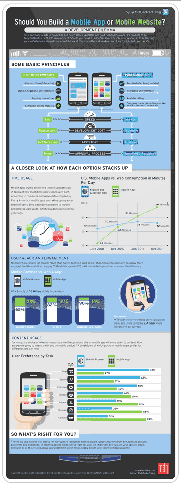
If you are in the business of building and designing websites, you cannot ignore the fact that many people are going to be visiting your sites on their smartphones and tablets. The Web and the mobile browsers remain one of the top ways that users interact with websites and if they have trouble on their smartphone, there is a good chance they are not coming back.

That’s where responsive design can help.

Responsive design is a concept where you build your website once and then format it so it can adapt to any screen size that accesses it. Designers use HTML5 and CSS to build the sites and set parameters so the content will resize itself whether the user is in vertical or horizontal viewing mode, on a tablet, desktop or smartphone or even a screen as large as a television.

via 10 Developer Tips To Build A Responsive Website [Infographic] – ReadWrite.

Tips Responsive Web Design

15 Web Design Trends for 2013…04.13.13 | The Proverbial Lone Wolf Librarian’s Weblog


15 Web Design Trends for 2013…04.13.13 | The Proverbial Lone Wolf Librarian’s Weblog

Original source slideshare presentation | David Lee King

  1. content first
  2. design simplicity
  3. UX centred design
  4. app style interfaces
  5. responsive design
  6. no skeuomorphism
  7. coding languages
  8. fixed header bars
  9. large photo backgrounds
  10. CSS transparency
  11. social media badges
  12. infinite scrolling
  13. homepage feature tours
  14. sliding panels
  15. parallax design

20 Excellent Wireframing Tools for Mobile | Mashable


20 Excellent Wireframing Tools for Mobile | Mashable

This is the list from Mashable:

  1. Framer – Modern prototyping tool

  2. Indigo Studio – Rapid, interactive prototyping

  3. Mockingbird – Wireframes on the fly

  4. Simulify – Interactive, shareable wireframes, mockups and prototypes

  5. Solidify – Create clickable prototypes

  6. Lovely Charts – Diagramming app with desktop and mobile versions

  7. ForeUI – Easy to use UI prototyping tool

  8. Creately – Realtime diagram collaboration

  9. JumpChart – Architecture, layout and content planning

  10. Lumzy – Mockup creation and prototyping tool

  11. Concept.ly – Convert wireframes and designs into interactive apps

  12. Frame Box – Easy, simple wireframing

  13. Realizer – Interactive presentation prototypes

  14. Cacoo – Diagrams with realtime collaboration

  15. Mockup Builder – Super-easy prototyping and mockups

  16. Tiggzi – Develop cross platform mobile apps fast

  17. Mockup Designer – Basic wireframing tool hosted on GitHub

  18. ClickDummy – Turn mockups into clickable prototypes

  19. Mockups.me – Create and present interactive UI wireframes

  20. Mockabilly – iPhone mockups with genuine iphone behavior

  21. RWD Wireframes – Wireframing tool for responsive layouts

  22. Blocks – Create annotated HTML prototypes

  23. UX Toolbox – Create, document and share wireframes and prototypes

Responsive web design vs. mobile app development | TechRepublic


Most businesses and organizations have websites, and with the popularity and proliferation of all sizes of mobile devices, a mobile strategy for those websites is more important than ever.

via Responsive web design vs. mobile app development | TechRepublic

Mobile App or Mobile Website?

Responsive Web Design Resources | This Is Responsive


Responsive Web Design Resources | This Is Responsive

Lists 85 resources about the various aspects of responsive web design.

Also see: 85 Top Responsive Web Design Tools | Mashable in which 10 of these resources are reviewed in depth.

The Five Worst UX Mistakes Websites Make | UX Magazine


The Five Worst UX Mistakes Websites Make | UX Magazine

  • Mistake #1: Paying too much Attention to the Macro and Short-Shrifting the Micro
  • Mistake #2: Putting too much Time into Designing your Home Page
  • Mistake #3: Relying too much on Text
  • Mistake #4: Designing for the Wrong Generation
  • Mistake #5: Ignoring Multi-Screen Behavior

Collection of Links: Resources for Libraries


Apps
Free Software for Libraries Ideas Exchange – iLibrarian
50 Great Mobile Apps for Librarians – Proverbial Lone Wolf Librarian’s Weblog

Technology
Internet Librarian: Speed Technology Dating – Librarian in Black (30 technology recommendations – from Raspberry Pi to Liquid Space)
How to Create Your Own Knowledge Base – iLibrarian
Library Now! Google now technology applied to libraries? – Musings about Librarianship
What To Do with a Raspberry Pi (The New $35 Computer That Could Replace Your Opac Terminals) – The Digital Shift
Digitally Embedding the Law Library – Ellyssa Kroski

Web Design and Websites
Responsive Web Design and Libraries – iLibrarian
Transforming the Library Website: You and the IT Crowd – iLibrarian
Blogging Mega-post: 21 Resources for Tips, Strategies, and Content Ideas – iLibrarian
10 Essential Tools for the Lean Web Developer – Mashable

Vevo Quietly Redesigns Its Homepage To Streamline Search, Navigation, And Playlist Creation | TechCrunch


I think the new Vevo homepage  is a great example of the minimalist trend in user experience – minimizing the number of features and functions available for a more immersive user experience. I appreciate how Search is  top center of the screen, but not so blatant in form and having transparency – it’s not continually distracting to the eye (as opposed to search on the Hula.com homepage, which is distracting).

Vevo Quietly Redesigns Its Homepage To Streamline Search, Navigation, And Playlist Creation | TechCrunch.