Circle of Life: The Beautiful New Way to Visualize Biological Data | Wired Science


Krzywinski developed Circos, an open source visualization tool that arranges tabular data in circular form. It was a simple idea, but transformative: It’s since been used for thousands of visualizations, and its distinctive aesthetic is synonymous with the informational richness of our moment.

Read: Circle of Life: The Beautiful New Way to Visualize Biological Data | Wired Science

For more on Martin Krzywinski’s science art take a look at his website.

Circle of Life: The Beautiful New Way to Visualize Biological Data - Wired Science

Why Are Infographics So Popular? [Infographic] | Marketing Technology Blog


According to Graphs.net, research shows that the search volume for Infographics has increased by a whopping 800% between 2010 and 2012. Wow! At the same time, there’s been an explosion of popularity with visual content – from technologies like Postano to platforms like Pinterest. Visual mediums aren’t going anywhere… I believe their popularity will continue to grow over the next few years.

via Why Are Infographics So Popular? [Infographic] | Marketing Technology Blog

Why are infographics so popular?

Eric Berlow and Sean Gourley: Mapping ideas worth spreading | TED.com


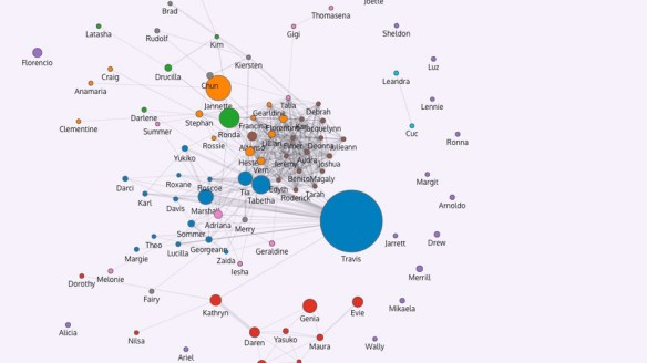
What do 24,000 ideas look like? Ecologist Eric Berlow and physicist Sean Gourley apply algorithms to the entire archive of TEDx Talks, taking us on a stimulating visual tour to show how ideas connect globally.

via Eric Berlow and Sean Gourley: Mapping ideas worth spreading | Video on TED.com.

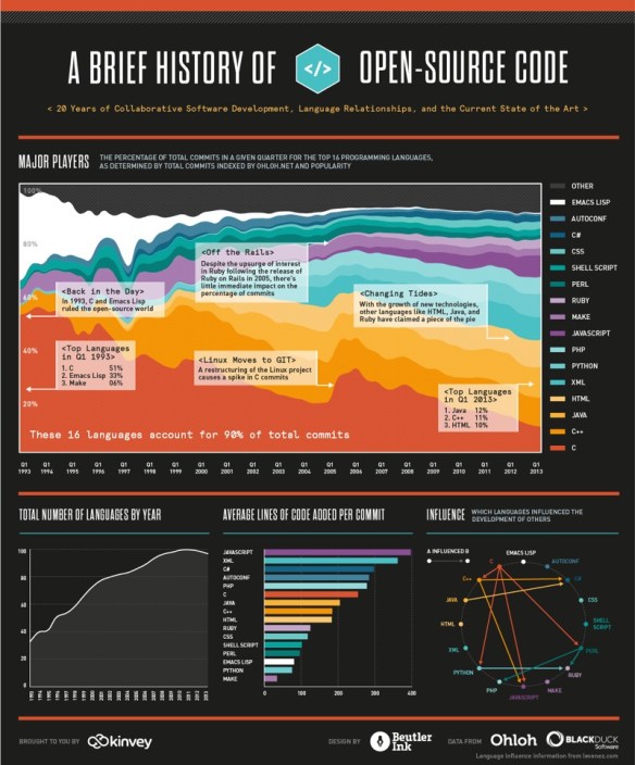
A Visual History Of The Last 20 Years Of Open Source Code | ReadWrite


We were able to visualize the percentage of total commits in a given quarter for the top 16 programming languages from 1993 until today. We hope you’ll find this image—a provocative pattern of dips and spikes—to be as interesting as we do. It truly shows how dynamic the world of programming is. We’ve also included a few graphs on other interesting data points: total number of languages by year, average lines of code per commit, and tracking which languages influenced the development of others.

Visual History Of The Last 20 Years Of Open Source Code

via A Visual History Of The Last 20 Years Of Open Source Code | ReadWrite.

The Smithsonian Just Added a Chunk of Code to Its Permanent Collection | Gizmodo


Great to see an organization swoop in, so to speak, to preserve a defunct application, then go a step further and open the source code to developers. Hope to see this happen more often.

The Smithsonian’s Cooper-Hewitt design museum in New York just acquired the source code to an iPad app called Planetary from its now-defunct developer. Code is officially art now.

Planetary, as you can see in the video above, is basically a fancy music visualizer. The app’s source code was donated to the Cooper-Hewitt, which promptly open-sourced the code in hopes that people will use its visualization methods for other applications. Beyond the original lines of code, the museum has made a commitment to preserving the offshoots of the open-source project, and to nurturing their development. Planetary’s source has also been printed out in machine-readable OCR-A font on archival stock. Apparently, posterity demands a physical paper record that’s a little less fleeting than a digital archive.

See the full story: The Smithsonian Just Added a Chunk of Code to Its Permanent Collection | Gizmodo.

Do-It-Yourself GIS: 20 Free Tools & Data Sources for Creating Data Maps | Ellyssa Kroski – OEDB.org


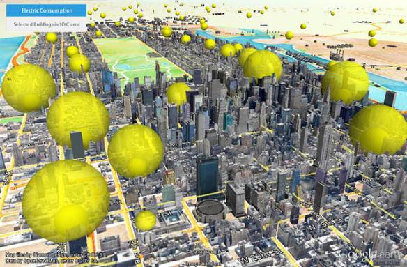
The world of mapping and presenting data sets through geographical representations is no longer relegated to GIS librarians and highly trained technologists. New free and open source applications now make it possible to create complex and robust data visualizations in the form of maps that display statistics and poll results. Here’s a guide to 20 free applications and data sources.

via Do-It-Yourself GIS: 20 Free Tools & Data Sources for Creating Data Maps | Ellyssa Kroski – OEDB.org.

There are 6 data visualization tools listed and 14 sources for GIS mapping data.

Also see my list of Interactive Mapping Resources on The Modern MLIS. I have categorized resources as either digital libraries, visualization tools or stargazing maps. There is only a little overlap with Ellyssa’s list.

You may also like:  Ten Places to Find and Create Data Visualizations | FreeTech4Teachers

This Comprehensive Map Traces 463 of the Bible’s Contradictions | Gizmodo


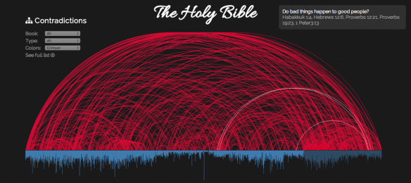
Using data from the Skeptic’s Annotated Bible, programmer Daniel G. Taylor created this encyclopedic visualization of 463 of the Bible’s major contradictions. Here’s how to read it: Each vertical blue line represents a different chapter, ordered chronologically. The red arcs trace each represent a question about a specific person or concept.  Clicking on one of the red lines takes you to a list of every relevant quote from both Old and New Testaments.

The Holy Bible Contradictions

See the full story: This Comprehensive Map Traces 463 of the Bible’s Contradictions | Gizmodo.

The Art of Data Visualization | PBS Video


From scientific visualization to pop infographics, designers are increasingly tasked with incorporating data into the media experience. Data has emerged as such a critical part of modern life that it has entered into the realm of art, where data-driven visual experiences challenge viewers to find personal meaning from a sea of information, a task that is present in every aspect of our lives.

See the Video: The Art of Data Visualization | Watch Off Book Online | PBS Video