
It’s truly amazing, the wealth of information we all have at our fingertips — that is, of course, unless your fingertips are how you have to access that information. An innovative new tablet that uses magnetically configurable bumps may prove to be a powerful tool for translating information like maps and other imagery to a modality more easily accessed by the visually impaired.The tablet, unnamed as yet, has evolved and improved over the past few years as part of Europe’s BlindPAD project, which aims to create a cheap, portable alternative to touchscreen devices. READ MORE: BlindPAD’s tablet makes visual information tactile for the vision-impaired | TechCrunch
Tag Archives: visualization
Pairing Wine and Cheese with Data Science | Center for Data Innovation #dataviz #data #datascience #databases #visualization
University of Toronto computational biology professor Gary Bader has created an interactive data visualization that allows users to identify complementary wine and cheese pairings based on different factors, including a wine’s country of origin and a cheese’s moisture level. The visualization uses software called Cytoscape that Bader and other researchers initially developed for complex genetic and molecular analysis, such as mapping the relationship between different genes and autism or cancer. Users can search for approximately 1,000 ideal pairings between 100 different red and white wines and 270 cheeses. READ: Pairing Wine and Cheese with Data Sciencw | Center for Data Innovation
We Need a Better Way to Visualize People’s Skills | HBR #skills #data #visualization #employment #analytics #competencies
Photo Source: HBR
How can companies get a better idea of which skills employees and job candidates have? While university degrees and grades have done that job for a long time, they’ve done it imperfectly. In today’s rapidly evolving knowledge economy, badges, nanodegrees, and certificates have aimed to bridge the gap – but also leave a lot to be desired. While HR departments are eager for better “people analytics,” that concept is still fuzzy. And simply collecting data is not enough – to be used, data has to be presented usefully. READ MORE: We Need a Better Way to Visualize People’s Skills | HBR
Data USA from MIT Media Lab is a Stunning New Tool for Analysts, Economists and Data Geeks #data #tools #visualization #statistics #dataviz #tech

MIT Media Lab and partners Deloitte and data visualization startup Datawheel, have launched a mammoth and stunning new tool called Data USA, where users are able to mine and visualize United States Government open data. Data USA is great new tool for analysts, economists, and data geeks. Data USA has gathered data from what used to be multiple sources into a singular open data platform.
As a Research Analyst for Calgary Economic Development, managing and analyzing data is a critical component of my work. With the current economic downturn, improved data interpretation and analysis tools such as Data USA, are increasingly important. We use data from Statistics Canada and other organizations to compare economic indicators for Calgary to other cities in Canada and North America. With this analysis we can then determine how Calgary ranks competitively with other metropolitan areas. We use this insight to create strategies to promote our city, attract business and diversify our economy. Open data rocks!
#Data Artist Proves Just How Unique Shakespeare’s 154 Sonnets Really Are | HuffPost #Shakespeare #poetry #analysis #visualization #art

In data artist Nicholas Rougeux’s new series of Shakespeare sonnet signatures, each poem is summarized with its own distinctive scribble — a shorthand that may not help them with Capital One, but allows readers to quickly visualize the individuality of each poem. “No two are the same — or even similar,” Rougeux noted… READ MORE: Data Artist Proves Just How Unique Shakespeare’s 154 Sonnets Really Are | HuffPost
30 Simple #Tools For #Data #Visualization | Co.Design #tech
There have never been more technologies available to collect, examine, and render data. Here are 30 different notable pieces of data visualization software good for any designer’s repertoire. They’re not just powerful; they’re easy to use. In fact, most of these tools feature simple, point-and-click interfaces, and don’t require that you possess any particular coding knowledge or invest in any significant training. Let the software do the hard work for you. Your client will never know. MORE: 30 Simple Tools For Data Visualization | Co.Design | business + design.
Additional data visualization services, such as Creately, Doodle.ly and Viewshare listed on infophile’s Tools webpage.
Google’s Dream Robot Is Running Wild Across the Internet | Gizmodo #images #algorithms #visualizations
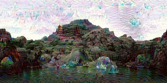
Remember a few weeks back, when we learned that Google’s artificial neural network was having creepy daydreams, turning buildings into acid trips and landscapes into Magic Eye pictures? Well, prepare to never sleep again, because last week, Google made its “inceptionism” algorithm available to the public, and the nightmarish images are cropping up everywhere.
The “Deep Dream” system essentially feeds an image through a layer of artificial neurons, asking an AI to enhance and build on certain features, such as edges. Over time, pictures can become so distorted that they morph into something entirely different, or just a bunch of colorful, random noise.
Now that the code for the system is publicly available, anyone can upload a photo of their baby and watch it metamorphose into a surrealist cockroach, or whatever. If you need some inspiration, or an excuse to crawl back into bed, pull the covers over your face, and wait for the world to end, just check out the hashtag ‘DeepDream’ on your social media platform of choice. READ MORE: Google’s Dream Robot Is Running Wild Across the Internet | Gizmodo.
Also See: DeepDream – A Code Example for Visualizing Neural Networks | Google Research Blog
Why I Write in #PowerPoint | HBR + Book Written Entirely In PowerPoint Aims To Reinvent How Businesses Communicate | FastCompany #business #communication
When writing business documents (aside from emails), most people turn to word-processing software. That’s not the only option. You can do everything — outlines, drafts, revisions, and even layouts, if you’d like — in PowerPoint or similar presentation programs. That’s what I’ve used to write my books, internal documents, sales collateral, and web copy, for several reasons. READ MORE: Why I Write in PowerPoint | Harvard Business Review
Raise your hand if you like sitting through slide-show presentations. How about reading dense, jargony business documents? These are the staples of modern business communication, and yet they’re enjoyed by precisely no one. Enter Nancy Duarte, CEO of Duarte Design. Duarte thinks she can redesign business communication with Slidedocs, a new concept she defines as “a visual document, developed in presentation software, that is intended to be read and referenced instead of projected.” Think of it as a kind of a hybrid between slide-show presentations and prose documents—but one that eliminates the most annoying qualities of each. Duarte’s new book on Slidedocs, which she wrote entirely in PowerPoint, has just been released as a free download on her website. READ MORE: Book Written Entirely In PowerPoint Aims To Reinvent How Businesses Communicate | FastCompany
Learn About the Internet of Things with This Interactive Visualization | LifeHacker #IoT #InternetofThings @infobeautiful
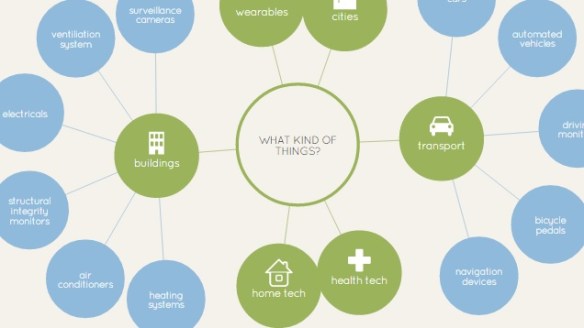
If you’re still trying to wrap your head around what the “Internet of Things” is, this data visualization makes things easy to understand and is fun to explore.
The visualization, from the team at Information is Beautiful, does a great job of explaining what the Internet of Things is, what it can and will affect, who the major players are, and even provides some eye-opening statistics regarding the direction we’re all headed with technology. Additionally, it mentions some of the challenges facing our “always connected” world. You can check it out at the link.
The Internet of Things | Information is Beautiful
via Learn About the Internet of Things with This Interactive Visualization | LifeHacker
A Dead-Simple Tool That Lets Anyone Create Interactive Maps | WIRED

Data surrounds us. It’s everywhere, in the most micro sense small gadgets that track calories we’ve burned, or how much water our plants need to the most macro analytics companies that can monitor, for instance, the health of entire populations. But there are precious few companies actively working on helping us make sense of all that data. One of them is Tableau, a software company that turns heaps of data into visualizations for the common man: teachers, doctors, journalists, you name it. To make those tools clearer and cleaner, they recently partnered with Stamen Design, to release three new map templates, which anyone can play around with by downloading Tableau’s free software.
READ MORE A Dead-Simple Tool That Lets Anyone Create Interactive Maps | Design | WIRED.
