
University of Toronto computational biology professor Gary Bader has created an interactive data visualization that allows users to identify complementary wine and cheese pairings based on different factors, including a wine’s country of origin and a cheese’s moisture level. The visualization uses software called Cytoscape that Bader and other researchers initially developed for complex genetic and molecular analysis, such as mapping the relationship between different genes and autism or cancer. Users can search for approximately 1,000 ideal pairings between 100 different red and white wines and 270 cheeses. READ: Pairing Wine and Cheese with Data Sciencw | Center for Data Innovation
Tag Archives: data visualization
We Need a Better Way to Visualize People’s Skills | HBR #skills #data #visualization #employment #analytics #competencies
Photo Source: HBR
How can companies get a better idea of which skills employees and job candidates have? While university degrees and grades have done that job for a long time, they’ve done it imperfectly. In today’s rapidly evolving knowledge economy, badges, nanodegrees, and certificates have aimed to bridge the gap – but also leave a lot to be desired. While HR departments are eager for better “people analytics,” that concept is still fuzzy. And simply collecting data is not enough – to be used, data has to be presented usefully. READ MORE: We Need a Better Way to Visualize People’s Skills | HBR
Data USA from MIT Media Lab is a Stunning New Tool for Analysts, Economists and Data Geeks #data #tools #visualization #statistics #dataviz #tech

MIT Media Lab and partners Deloitte and data visualization startup Datawheel, have launched a mammoth and stunning new tool called Data USA, where users are able to mine and visualize United States Government open data. Data USA is great new tool for analysts, economists, and data geeks. Data USA has gathered data from what used to be multiple sources into a singular open data platform.
As a Research Analyst for Calgary Economic Development, managing and analyzing data is a critical component of my work. With the current economic downturn, improved data interpretation and analysis tools such as Data USA, are increasingly important. We use data from Statistics Canada and other organizations to compare economic indicators for Calgary to other cities in Canada and North America. With this analysis we can then determine how Calgary ranks competitively with other metropolitan areas. We use this insight to create strategies to promote our city, attract business and diversify our economy. Open data rocks!
11 #Shakespeare Tragedies Mapped Out with Network Visualizations | Open Culture #dataviz #data #visualizations #analysis #plays #books
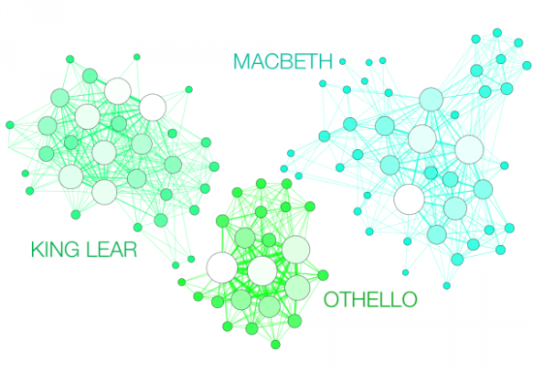
Every story has its architecture, its joints and crossbeams, ornaments and deep structure. The boundaries and scope of a story, its built environment, can determine the kind of story it is, tragedy, comedy, or otherwise. And every story also, it appears, generates a network—a web of weak and strong connections, hubs, and nodes. Take Shakespeare’s tragedies. We would expect their networks of characters to be dense, what with all those plays’ intrigues and feasts. And they are, according to digital humanities, data visualization, and network analysis scholar Martin Grandjean, who created the charts you see here: READ MORE: 11 Shakespeare Tragedies Mapped Out with Network Visualizations | Open Culture
30 Simple #Tools For #Data #Visualization | Co.Design #tech
There have never been more technologies available to collect, examine, and render data. Here are 30 different notable pieces of data visualization software good for any designer’s repertoire. They’re not just powerful; they’re easy to use. In fact, most of these tools feature simple, point-and-click interfaces, and don’t require that you possess any particular coding knowledge or invest in any significant training. Let the software do the hard work for you. Your client will never know. MORE: 30 Simple Tools For Data Visualization | Co.Design | business + design.
Additional data visualization services, such as Creately, Doodle.ly and Viewshare listed on infophile’s Tools webpage.
So you want to be a Data Visualization Librarian? | hls #librarians #dataviz #MLIS
So you know that you want to be a librarian, but have you thought about specializing in a certain field? Maybe you have an interest in emerging technologies or you want to work with researchers and students across the disciplines? Data visualization is a hot topic in librarianship, and specializations in data analytics and visualization is an exciting area of growth in the profession. I sat down with four visualization specialists who work within the University of Michigan Library system to get an idea of what their jobs entail.
READ MORE: So you want to be a Data Visualization Librarian? | hls.
How To Build A Data Visualization From Scratch | Co.Design #datavisualization
http://www.fastcodesign.com/embed/fd8175cb4fa2c?rel=1&src=embed&veggiemode=1
In this exclusive video created by R/GA with Fast Company, the advertising agency’s data team explains the basics of the art and science of data viz. “We have a mantra that we say: ‘The data is the brief,'” says R/GA managing director Marc Maleh. “The data is what’s going to tell the story—everything else comes second to that.” READ MORE: How To Build A Data Visualization From Scratch | Co.Design | business + design
You may also like:
This Clever Image Search Could Change The Way You Find Pictures Online | Gizmodo

Compared to searching for text, searching for images is super hard. But a new way to index and navigate through averaged images—those blurry composites that pull together millions of images into one—could radically change the way that we search for photos or products online.
READ MORE: This Clever Image Search Could Change The Way You Find Pictures Online | Gizmodo
A Dead-Simple Tool That Lets Anyone Create Interactive Maps | WIRED

Data surrounds us. It’s everywhere, in the most micro sense small gadgets that track calories we’ve burned, or how much water our plants need to the most macro analytics companies that can monitor, for instance, the health of entire populations. But there are precious few companies actively working on helping us make sense of all that data. One of them is Tableau, a software company that turns heaps of data into visualizations for the common man: teachers, doctors, journalists, you name it. To make those tools clearer and cleaner, they recently partnered with Stamen Design, to release three new map templates, which anyone can play around with by downloading Tableau’s free software.
READ MORE A Dead-Simple Tool That Lets Anyone Create Interactive Maps | Design | WIRED.
The Secrets Of A Memorable Infographic | Co.Design
Human memory is very fallible, but lately cognitive scientists have found that our minds capture much more visual detail in a moment than once believed. A 2008 paper reported that people who saw thousands of images for three seconds each over five hours later identified ones they’d seen over similar alternatives with nearly 90% accuracy. They didn’t just remember that they’d seen a cracked egg, they remembered that its egg white had formed a perfectly round puddle.
In other words, when we do retrieve a memorable image, a surprising amount of information comes with it, like a burr stuck to a sweater. That insight could have big implications for people who use visualizations in their everyday lives–graphic designers, for instance, or anyone on Tumblr. Above all, it suggests that memorability alone might enhance an infographic’s effectiveness. But it also prompts a question: How does an image become memorable in the first place?
Read: The Secrets Of A Memorable Infographic | Co.Design | business + design.
