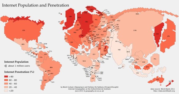
The map, created as part of the Information Geographies project at the Oxford Internet Institute, has two layers of information: the absolute size of the online population by country (rendered in geographical space) and the percent of the overall population that represents (rendered by color). Thus, Canada, with a relatively small number of people takes up little space, but is colored dark red, because more than 80 percent of people are online. China, by contrast, is huge, with more than half a billion people online, but relatively lightly shaded, since more than half the population is not online. Lightly colored countries that have large populations, such as China, India, and Indonesia, are where the Internet will grow the most in the years ahead. (The data come from the World Bank’s 2011 report, which defines Internet users as “people with access to the worldwide network.”)
Tag Archives: maps
A Map of Internet Freedom Around the World | Gizmodo
Here in the US, it’s easy to slip into the comfortable idea that the internet is unrestricted, a home for free speech and exploration, whether it’s meaningful and important, or dumb hashtags. It’s not that way everywhere though, and Freedom House has mapped out the current state of affairs across the globe.
Read and see more charts: A Map of Internet Freedom Around the World | Gizmodo
The Most Popular Websites in the World, Country-by-Country | Gizmodo
If you’ve ever wondered what the go-to web page was around the rest of planet, wonder no longer. This map shows the most visited websites around the world, broken down country-by-country.
Read: The Most Popular Websites in the World, Country-by-Country | Gizmodo.
42 Maps that Will Change How You Think About the World | Gizmodo
You Can Now Explore the Galapagos Islands With Google Street View | Gizmodo
The Galapagos is one of the most biodiverse places on the planet, and it was key in Charles Darwin’s findings in forming the the scientific argument of evolution. You may never get to travel to the volcanic archipelago in person, but now thanks to Google, you can explore it through 360-degree imagery on Street View.
The full story: You Can Now Explore the Galapagos Islands With Google Street View | Gizmodo.
You may also like: Darwin for a Day lets you play scientist, explore the Galapagos in Street View | Engadget
40 maps that explain the world | Washington Post
Maps can be a remarkably powerful tool for understanding the world and how it works, but they show only what you ask them to. Some of these are pretty nerdy, but I think they’re no less fascinating and easily understandable. A majority are original to this blog (see our full maps coverage here), with others from a variety of sources.
Wikimedia Commons
via 40 maps that explain the world | Washington Post.
You may also like: 40 Maps They Didn’t Teach You In School | Bored Panda
Do-It-Yourself GIS: 20 Free Tools & Data Sources for Creating Data Maps | Ellyssa Kroski – OEDB.org
The world of mapping and presenting data sets through geographical representations is no longer relegated to GIS librarians and highly trained technologists. New free and open source applications now make it possible to create complex and robust data visualizations in the form of maps that display statistics and poll results. Here’s a guide to 20 free applications and data sources.
via Do-It-Yourself GIS: 20 Free Tools & Data Sources for Creating Data Maps | Ellyssa Kroski – OEDB.org.
There are 6 data visualization tools listed and 14 sources for GIS mapping data.
Also see my list of Interactive Mapping Resources on The Modern MLIS. I have categorized resources as either digital libraries, visualization tools or stargazing maps. There is only a little overlap with Ellyssa’s list.
You may also like: Ten Places to Find and Create Data Visualizations | FreeTech4Teachers
4 Dazzling Stargazing Maps | Mashable
4 Dazzling Stargazing Maps | Mashable.
The 4 stargazing maps discussed:
- Planetarium
- Interactive Skychart
- 100,000 Stars
- Starmap
Placing Literature maps book scenes in the real world | Crave – CNET
Go behind the scenes of a new site based in Google Maps that combines geography, technology, and literature into a crowdsourced map of real locations from novels.
Eventually, users should be able to harness the site to put together trips, like a visit to the China sites mentioned in “The Joy Luck Club,” or a regional tour of Laura Ingalls Wilder locations. The potential for use in education and academic research is also tremendous.
via Placing Literature maps book scenes in the real world | Crave – CNET.


