
World Futurist Society: 20 Forecasts for 2013-2025 | Stephens Lighthouse. Some intriguing hypothesized forecasts in this article including Smart phones help spur political reform in Africa, A handheld “breathalyzer” will diagnose diseases and the Amish Boom.
Tag Archives: mobile
40 Great Apps for Mobile Reference and Outreach | American Libraries Magazine
The desire to learn about useful mobile apps is widespread among librarians, judging by the overflow crowd at Sunday’s Conversation Starter [ALA Conference 2013], billed to deliver “40 Great Apps for Mobile Reference and Outreach.”
via 40 Great Apps for Mobile Reference and Outreach | American Libraries Magazine.
Make Web sites mobile-friendly or face Google search wrath | Internet & Media – CNET News
If smartphone users have problems with your site, here’s some incentive to fix them: Google said Tuesday it plans to punish problematic sites with lower placement in search results.
via Make Web sites mobile-friendly or face Google search wrath | Internet & Media – CNET News.
10 Fun Ways to Feed Your Mind this Summer | Ellyssa Kroski – OEDB.org
10 Fun Ways to Feed Your Mind this Summer | Ellyssa Kroski – OEDB.org.
These include:
- Learn a new language
- Register for a MOOC
- Watch Videos from Recent Conferences
- Create an Awesome Summer Reading List
- Play an Educational Game
- Learn how to play an instrument
- Listen to Some Smart Podcasts
- Download Free Audiobooks
- Install Educational Apps on Your Tablet
- Read Free eBooks
See the article for the full discussion.
23 Mobile Things: Join the Australian / New Zealand Course « Tame The Web
23 Mobile Things: Join the Australian / New Zealand Course « Tame The Web
Excerpt below from Tame the Web | http://tametheweb.com/2013/05/01/23-mobile-things-join-the-australian-new-zealand-course/
What are the 23 Mobile Things?
- Taking a photo with a mobile device: Instagram / Flickr app / Snapchat
- eMail on the move
- Maps and checking in: Foursquare
- Photos + Maps + Apps: Historypin / What was there / Sepia Town
- Video: YouTube and screencasts
- Communicate: Skype / Google Hangout
- Calendar
- QR codes
- Social reading: RSS / Flipboard / Feedly / Goodreads / Pocket
- Augmented reality: Layar
- Games: Angry Birds / Wordfeud
- Online identity: FaceBook and LinkedIn
- Curating: Pinterest / Scoop.it / Tumblr
- Adobe ID
- eBooks and eBook apps: Project Gutenberg / Kindle / Overdrive / Bluefire / Kobo, etc.
- Evernote and Zotero
- Productivity tools: Doodle / Remember the Milk / Hackpad / any.do / 30/30
- File sharing: Dropbox
- Music: last.fm / Spotify
- Voice interaction and recording
- eResources vendor apps
- Digital storytelling
You can view the 23 Mobile Things on the official blog here –http://23mobilethings.net/wpress/the-things/
What is this NZ/Australian cohort all about?
simple; it is just establishing a group of librarians in NZ and Australia who are keen to do the 23 Mobile Things at the same time. This cohort will give us mutual support and contact with each other so that we can learn together and keep each other motivated. Hopefully it will help you grow your own personal learning network (PLN) and have fun and great collaborations throughout the course!
The Rise of the Mobile-Only User | Karen McGrane – HBR
If you’re trying to reach specific audiences, you can’t afford to ignore mobile-only users. As Pew Internet reports:
- Young adults: 50 percent of teen smartphone owners, aged 12-17, say they use the internet mostly on their cell phone, according to a 2013 Pew Internet report on Teens and Technology. Similarly, 45 percent of young adults aged 18-29 reported in 2012 that they mostly go online with a mobile device.
- Black and Hispanic adults: 51 percent of black Americans and 42 percent of Hispanic Americans who use a mobile device to access the internet say that’s the primary way they go online — about double the 24 percent of white Americans who say they rely on their mobile devices for access.
- Low-income adults: People whose household income is less than $30,000 per year and people with less than a college education are also more likely to rely on their mobile devices for access — about 40 percent of people in these groups say they primarily use their cell phone to go online. Healthcare, non-profit, and government institutions which need to reach these populations should be aware that their audience is mobile-only.
See the full article: The Rise of the Mobile-Only User | Karen McGrane – Harvard Business Review.
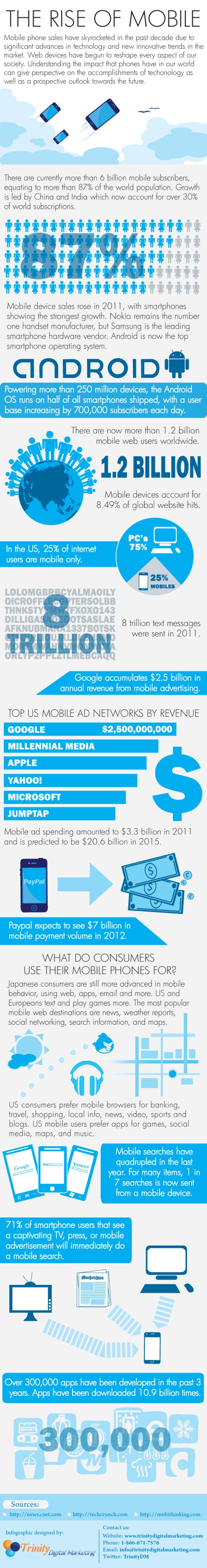
Infographic: 2012 Mobile Growth Statistics | DigitalBuzzBlog
The Future Of Technology Isn’t Mobile, It’s Contextual | Co.Design
Next up: Machines that understand you and everything you care about, anticipate your behavior and emotions, absorb your social graph, interpret your intentions, and make life, um, “easier.”
via The Future Of Technology Isn’t Mobile, It’s Contextual | Co.Design: business + innovation + design.
Forget Searching For Content – Content Is About To Start Searching For You – ReadWrite
The world of search is about to be flipped completely on its head. As part of that sea change, today’s reactive Web-based searches are about to give way to proactive, geo-fenced answers that will pop up before you even frame the question.
In many cases, you won’t be searching for content – content will be searching for you via Forget Searching For Content – Content Is About To Start Searching For You – ReadWrite.
How The Internet Of Things Will Revolutionize Search – ReadWrite
The rise of the Internet of Things means billions of physical objects will soon generate massive amounts of data 24 hours a day. Not only will this make traditional search methods nearly impossible to use, it will also create an environment where instead of looking for things in the world, those things will be seeking us out to give us all sorts of information that will help us fix, use or buy them.
via How The Internet Of Things Will Revolutionize Search – ReadWrite.
10 Developer Tips To Build A Responsive Website [Infographic] – ReadWrite
From the article:
Many website owners say to themselves, “I want my site to look great on mobile, but I don’t know where to start.”
If you are in the business of building and designing websites, you cannot ignore the fact that many people are going to be visiting your sites on their smartphones and tablets. The Web and the mobile browsers remain one of the top ways that users interact with websites and if they have trouble on their smartphone, there is a good chance they are not coming back.
That’s where responsive design can help.
Responsive design is a concept where you build your website once and then format it so it can adapt to any screen size that accesses it. Designers use HTML5 and CSS to build the sites and set parameters so the content will resize itself whether the user is in vertical or horizontal viewing mode, on a tablet, desktop or smartphone or even a screen as large as a television.
via 10 Developer Tips To Build A Responsive Website [Infographic] – ReadWrite.

 infophile